


Believe it or not, the font that you choose to use for your marketing can make a big difference in how your target perceives your message.
A font, or a typeface, is simply a style of text. There are thousands of fonts to choose from, many of which are free. Choosing one that matches your message is an essential part of the design process when developing your marketing pieces. Whether you’re working with a professional designer or creating your own marketing pieces, here are some guidelines for choosing the perfect font.
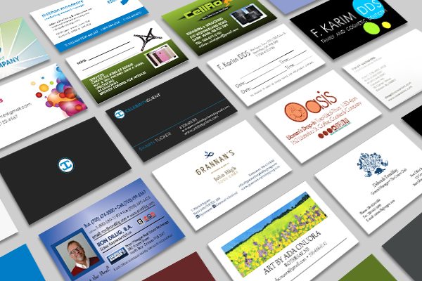
The Power of a Signature Font
Many companies have a signature font that is associated with their business that is simple and appropriate for a wide variety of uses.
Take for instance, Apple. Their website, their packaging, and even their commercials all feature the very same font. That is Myriad, and they’ve adopted it as their signature font since 2002. Even though they stick to the same font, it’s tried and true and it says a lot about their business. It’s clean, modern and simple; all characteristics that Apple associates with their products. Furthermore, this font has become so closely associated with Apple that customers can identify their products through the typeface alone – that’s a pretty powerful bit of branding.
If you have a signature font, feel free to use it if it makes sense to do so. Keep in mind that your signature font may change as your company grows. Apple started out using Apple Garamond, a completely different font. When they rebranded in 2002, their font changed to fit their more modern image. Don’t feel like you’re stuck with an outdated font if you feel that it no longer represents your company. Your brand adapts with your business’s growth and the passing of time.
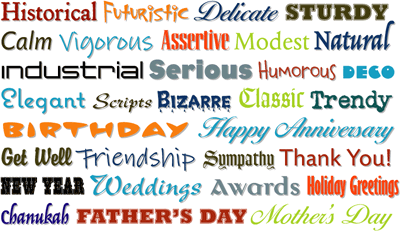
What Different Types of Fonts Convey
You might not realize it, but different fonts convey different messages. For example, here are a few different styles and their associations to consider when choosing a font.
Serifs are simply the little flourishes attached to the strokes on a letter. These types of fonts are easy to read, especially for long copy. Most novels and books use serif fonts. They look professional and traditional. Popular serif fonts include Times New Roman, Century, Garamond and Bodoni.
Sans means ‘without,’ so sans serif is a fancy way of saying a font that has no serifs. Sans serif fonts look clean and modern. They’re very simple, and one can be found to fit almost any situation. Popular sans serif fonts include Arial, Helvetica, Tahoma, Verdana and Trebuchet.
A script font is a cursive font. These fonts are very decorative, often with a lot of details and flourishes. They can be difficult to read, especially in long copy, so they’re best used in small doses. They can be used add a touch of sophistication or visual interest.
Just as it sounds, a handwritten font looks like it was written by a person. These types of fonts are great for adding a personalized touch, and some human warmth to your message.
Slab serifs are different from serifs in that instead of a small flourish, they have a thicker, heavier line at the end of each stroke. These fonts are bold, dominant and eye catching. They are good for headlines, but rarely used for long copy.
A display font is a unique visual style that doesn’t fall into another category. These types of fonts are often created to serve a very distinct purpose. For instance you can find decorative fonts with a western theme, holiday themes, sci-fi theme, etc. If you find one suited to your message, they can add a unique, visual twist to your piece.
Tips For Choosing a Font That Complements Your Message
Whether you’re seeking out a font to signature represent your brand, or simply a font for a one-time marketing piece, here are some tips for choosing a font that matches and enhances your message.
Don’t Go Overboard
Keep it simple. Though it might seem eye catching when you go all out with a crazy font (or several different fonts), it can be hard to read or overwhelming to your customers. Typically limiting yourself to one or two fonts per piece is also a good idea. The more fonts you select, the more complicated the piece seems. Remember, fonts should only enhance the message in your marketing, not distract from it.
Make it Legible
No matter how cool the font might look, it means absolutely nothing if your customers can’t read it. Make sure you get a pair of fresh eyes to check your message for legibility. You might think it’s easy to read if you’ve been hard at work designing it, but you already know what it says. A third party can offer an objective opinion and ensure that your customers will be able to read it at a glance.
Don’t Be Afraid of Contrast
To create interesting and dynamic marketing pieces, whether it’s a direct mailer, or an in-store display poster, all of your elements should offset and complement one another. Feel free to mix and match different types of fonts or styles, but remain aware of legibility and how your audience will react to the piece. Your design should complement your message.
Experiment With Your Design
Try a few different styles and font types before you settle on one. You never know if there’s something better out there until you try. Part of the design process for any marketing piece involves trying out a few styles before narrowing it down to the style that suits your theme, brand and marketing message!
Do you have any tips for choosing a font for marketing pieces? Please share your advice in the comments below. We want to hear about how you develop marketing pieces that work for your business.
If you need help designing professional marketing pieces such as direct mailers, posters, or signage for your brand, contact the Print Three location nearest you, to get paired up with professionals who are trained to help you design, produce and distribute marketing pieces custom-made for your brand.