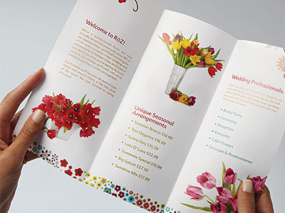
In this day and age, so much of the world’s advertising is done digitally, and designers work heavily with images for social media, websites, and online ads. Yet print is still a hugely important and highly-utilized form of communication. When translating digital design to print, there are certain steps graphic designers must take to ensure that the final print piece is of the best quality. Here are some top mistakes to avoid when translating digital design to print.
Image and Text Mistakes to Avoid
Whether you’re a designer or not, there are some boxes to tick that everyone should know when designing for print. One key step to remember is to convert your file to CMYK instead of RGB colour mode. CMYK (Cyan Magenta Yellow Black) is the colour mode in which printers produce colour (if you’ve ever changed an ink tray, you’ll know what we’re referring to!). However, digital design is produced using three colours: Red, Green and Blue (RGB). When working with a digital design, converting images to CMYK is typically the final step in the process. From there, designers can adjust the colour profiles or touch up anything that looks off, after the conversion occurs.
Another mistake to avoid is to ensure that all of your images are high resolution. Images for print typically need to be 300 dpi (pixels per inch) or higher to look clear and sharp in the final printed version. Designers often make the mistake of finding lower resolution images online, which may look fine on screen, but don’t translate to print. When dealing with wide format printers, you can sometimes get away with 150 dpi images, however, it’s always best to check final requirements with your local print shop.
When designing for large format printing, it’s important to remember that artwork and text need to be converted to vector art. This ensures that artwork can be scaled, without losing quality. Make sure you know the requirements of the medium you’re using, as small differences can make a great impact!
Digital Design to Print – Artwork and Final Files
A “bleed” is the additional space you carry your digital design into when you’d like your print design to go to the very edge of the page. This is achieved by printing the file on oversized paper and then cutting it using the crop marks to guide the final cut. The amount of bleed room will depend on the print, but generally, 3mm is the standard.
When creating booklets, designers need to account for page count and “creeps”. If you think of folding and stapling a booklet together, the excess paper will be trimmed, which is something designers need to be aware of when creating specific pages. Page count is important, as well, as booklets are completed in page counts of 4.
Another key mistake to avoid is spelling and grammar errors. Spelling mistakes happen often in printed pieces and this not only takes away from your message but also reflects poorly on your brand. Always have proofreaders and ensure that even if you have designers working on it, you also proofread everything before it goes to print. Doing a large format printed piece and then discovering an error can lead to a lot of headaches (and a hit to your budget!), so while it may seem obvious, it’s worth stating.
Print Three offers professional graphic design services. Contact us to learn more and to discuss your next print project!


